Visualisation of data sets
Using different visualisation techniques we can change the many numbers in to
lines, surfaces or three dimensional objects on the computer screen.
In this way the output is much
easier to look at. Instead of reading a huge amount of numbers and try to
understand them, we can use our brains superior capacity to analyse shapes
and sizes of objects. When you have got used to these artificial objects
it does not take a long time to look through huge amounts of data, looking
for small changes in the structure of the objects you have chosen to
visualise. In this way it is much easier to
construct an idea about the physical process' that control the experiment.
Below are three examples of data visualisation.
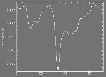
This plot shows the temperature at constant height above the photosphere in
prominence formation experiment.
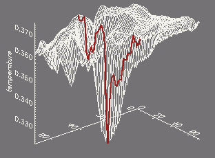
The temperature is here shown in a plane of constant height in the
same experiment as used above. The blue line represent the
data show in the previous image.
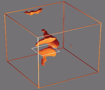
A surface of constant temperature is shown as a blue object. The surface
through the object indicates the height of the plot in the previous
image.
As you see the three different plots provide different information about the
problem and to get a good understanding of complicated experiments such as the
prominence formation experiment shown in the movie of the prominence formation,
we have to look at many
different things before we understand how and why the experiment
evolves in the way it does. It often takes longer to analyse the data
than to run the experiment on the computer!
Return to the "data analysis" page.